
Project overview
The product:
A mobile app for Mountain Outfitters, a fictitious camping supply store, that helps users compare product characteristics to make informed purchasing decisions.
The problem:
It can be overwhelming to choose the right camping gear because of the variety of products and features available.
The goal:
Design a user-friendly online experience where users can easily compare products by weight, capacity, price, and other features.
Project duration:
June-September 2025
My role:
This is a UX design coursework project. I led the complete design process to demonstrate the full range of skills I’ve learned.
Responsibilities:
User research, personas, problem statements, user journey maps
Information architecture
Paper & digital wireframing
Lo-fi & hi-fi prototyping
Design systems
User research
I conducted market and competitive research to better understand the camping supply space and identify common user experiences, features, and products. For user research, I interviewed individuals from my own network, creating as representative of a sample as possible given the hypothetical nature of this project. While this method has its limitations, it provided valuable insight into user goals, pain points, and motivations.
Pain points:
1. Decision fatigue
Users find it difficult to choose an item when presented with too many choices, making it hard for them to find the right product.
2. Inaccurate search
When search results don’t match what users are looking for, they are often confused or feel they are wasting their time.
3. Customer service
Users are frustrated when it’s difficult to find customer service contact information and return policies.
Persona: Avery
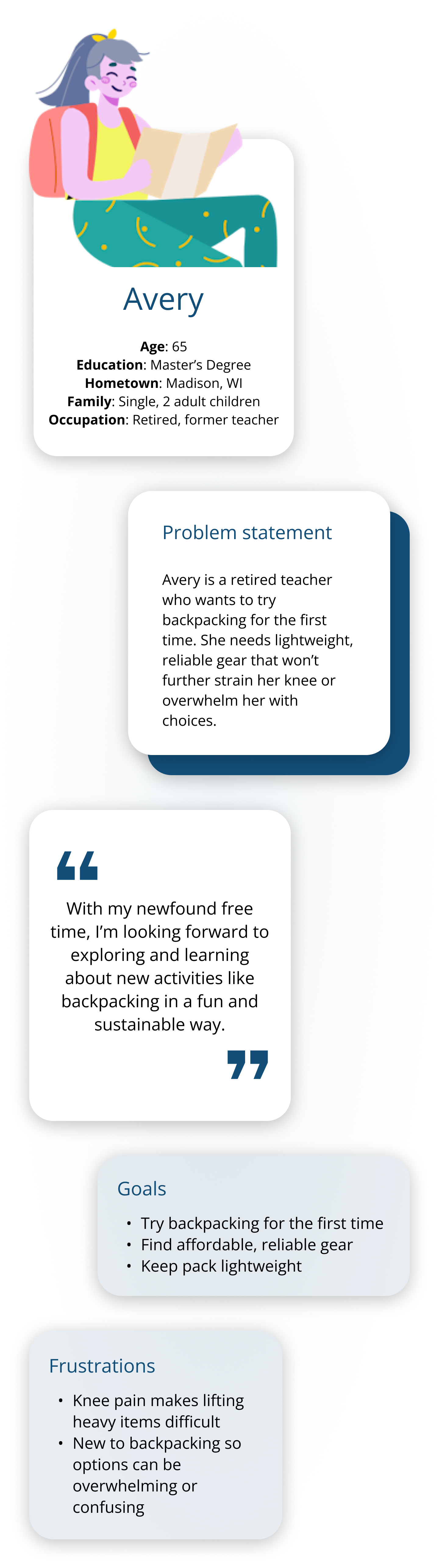
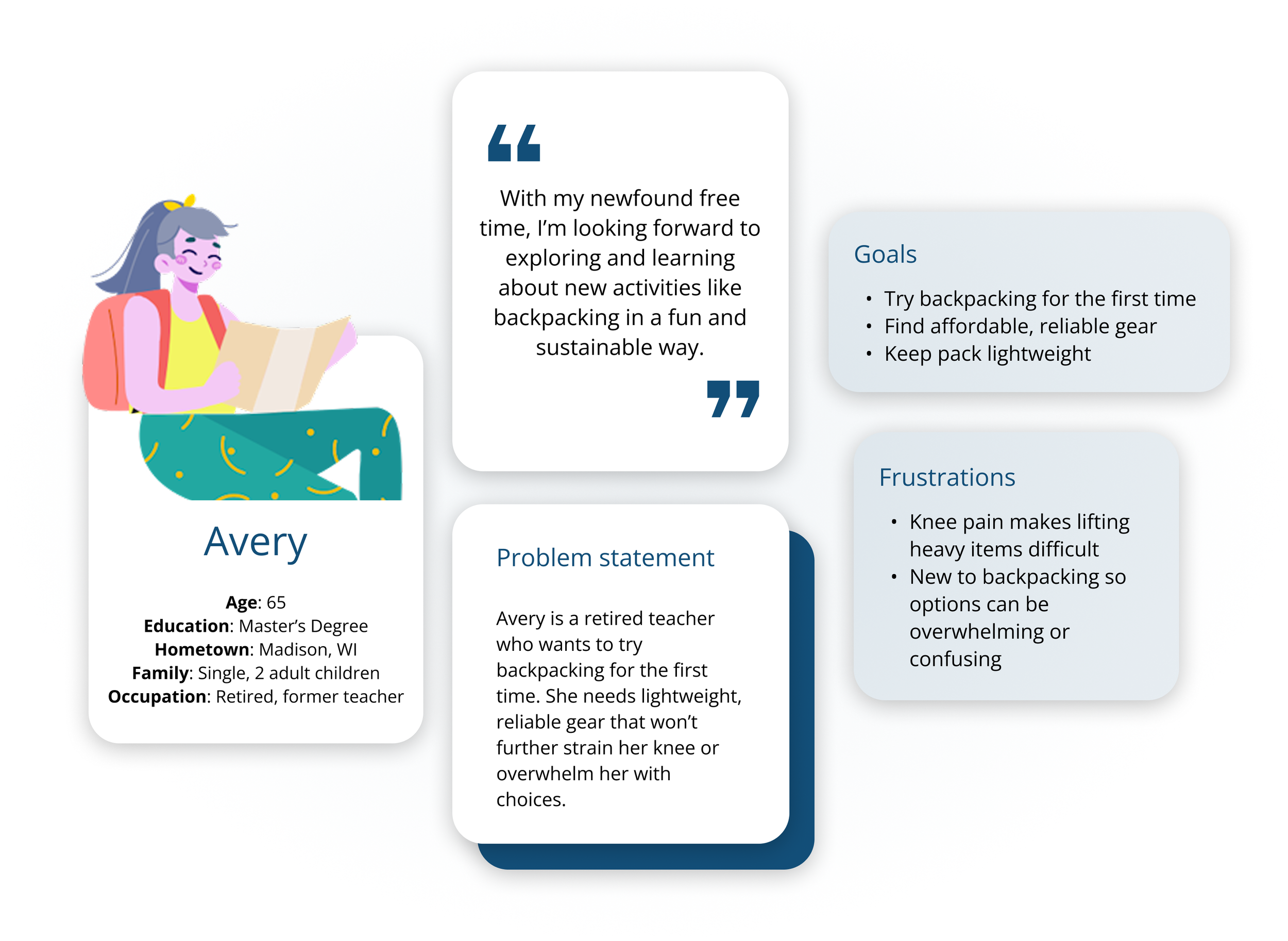
User journey map
Goal: Buy affordable and efficient backpacking gear.
| Actions | Start search for new gear | Explore product options | Compare and evaluate | Find return and exchange information | Complete purchase of item(s) |
|---|---|---|---|---|---|
| Task List | 1. Search camping websites and brands 2. Select platform to shop |
1. Browse products 2. Identify best sellers 3. Read customer reviews |
1. Compare items to find the best match 2. Select item that best suits needs |
1. Check return and warranty policy 2. Find customer service information |
1. Finalize items for purchase 2. Confirm cart items 3. Enter information 4. Place order |
| Feeling Adjective | I’m overwhelmed by the number of options to choose from. It’s hard to even know where to begin as a first time backpacker. | I’m reassured by reading other people’s reviews and ratings. It’s also helpful seeing which products are bestsellers. | I’m impressed with the ability to compare items, it is a very helpful feature. There are multiple items that suit my needs. | I’m frustrated with how difficult it is to find return instructions. I'm also having trouble finding where to contact customer service. This is making me more hesitant to buy. | I’m pleased with the smooth checkout process. It did take me a little while to enter all my information but overall it was a good first experience. |
| Improvement Opportunities | 1. Improve site navigation and product categorization | 1. Add videos demonstrating features and detailed product information | 1. Let users save products for later or to compare | 1. Make it easy to find customer service info 2. Add a chat feature to answer questions | 1. Allow users to create an account to save details for a faster future checkout experience |
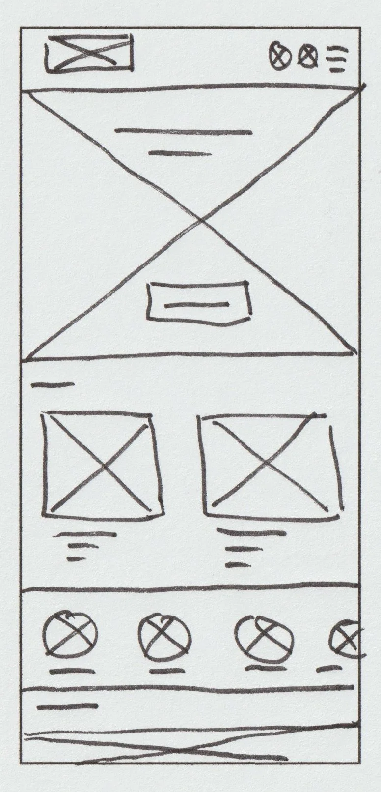
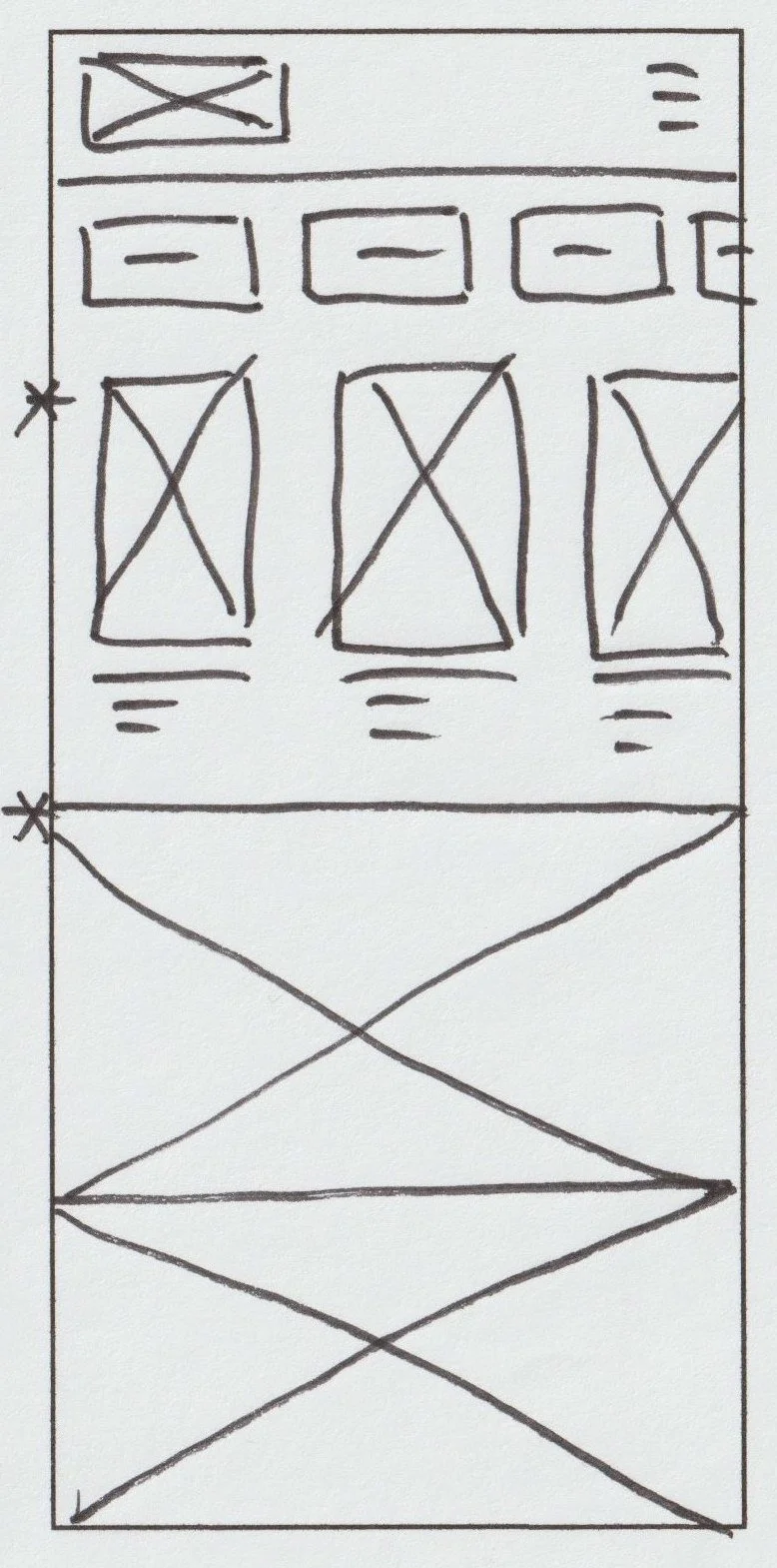
Beginning the design process
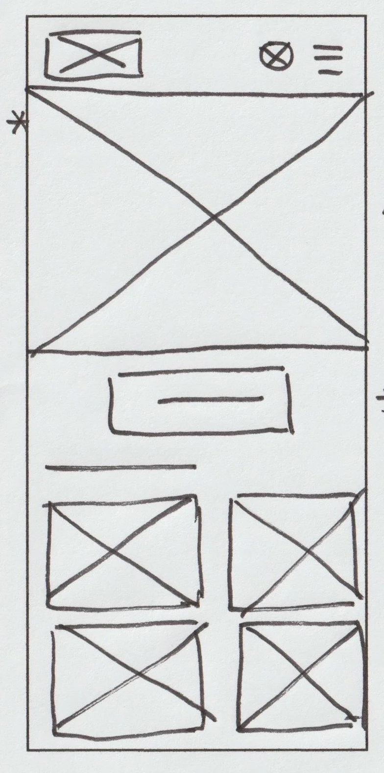
Paper wireframes
My goal was to make the homepage clear and easy to navigate. I began by sketching out various ideas of how the homepage might look (shown below), focusing on generating a lot of different possibilities. Then I iterated on these designs to refine them down to one design, repeating this process with the remaining key pages.
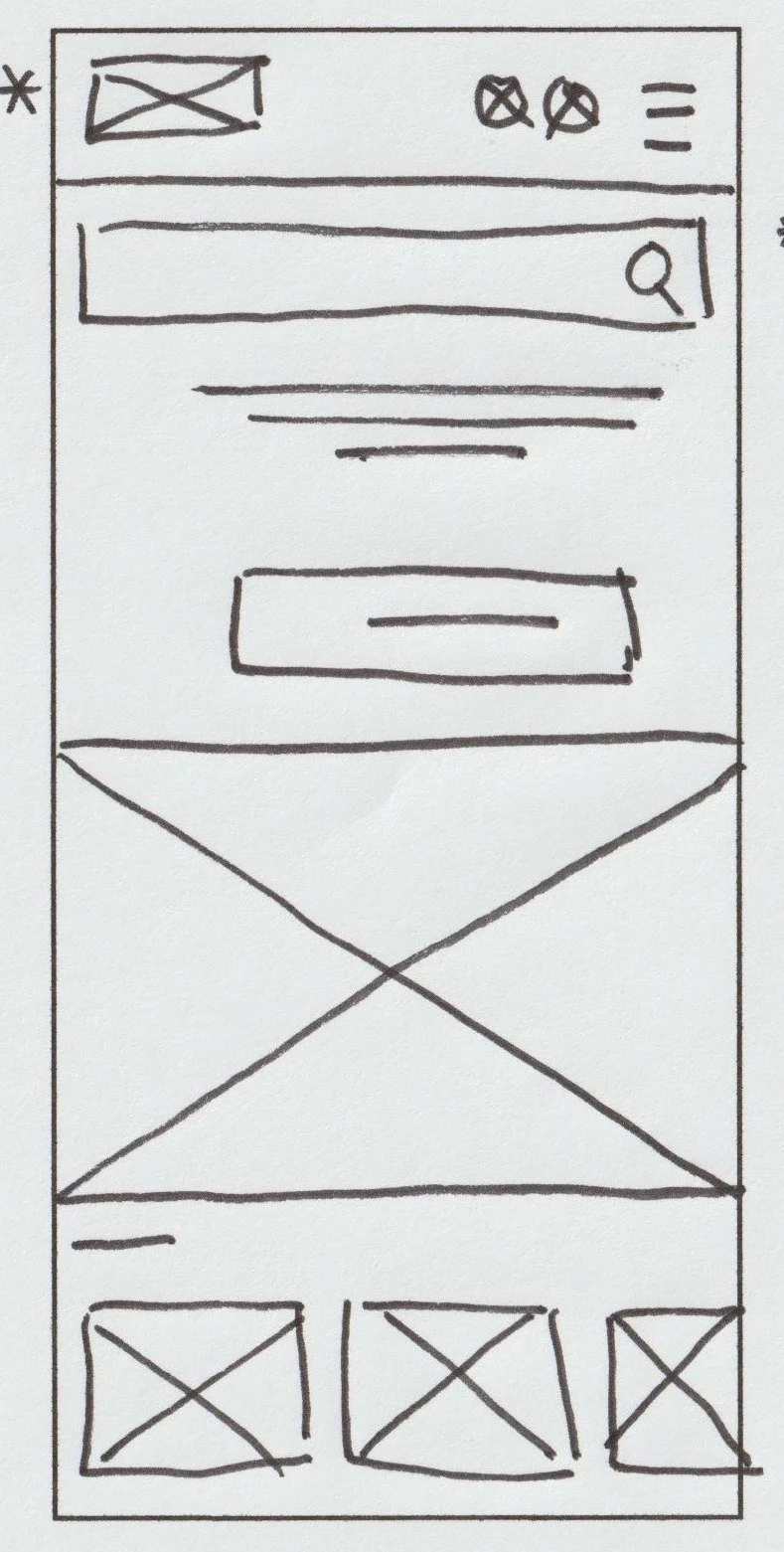
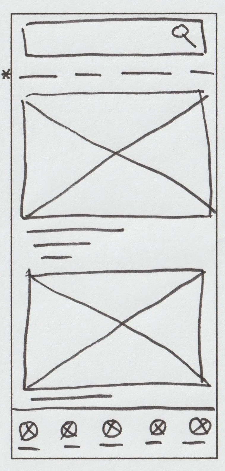
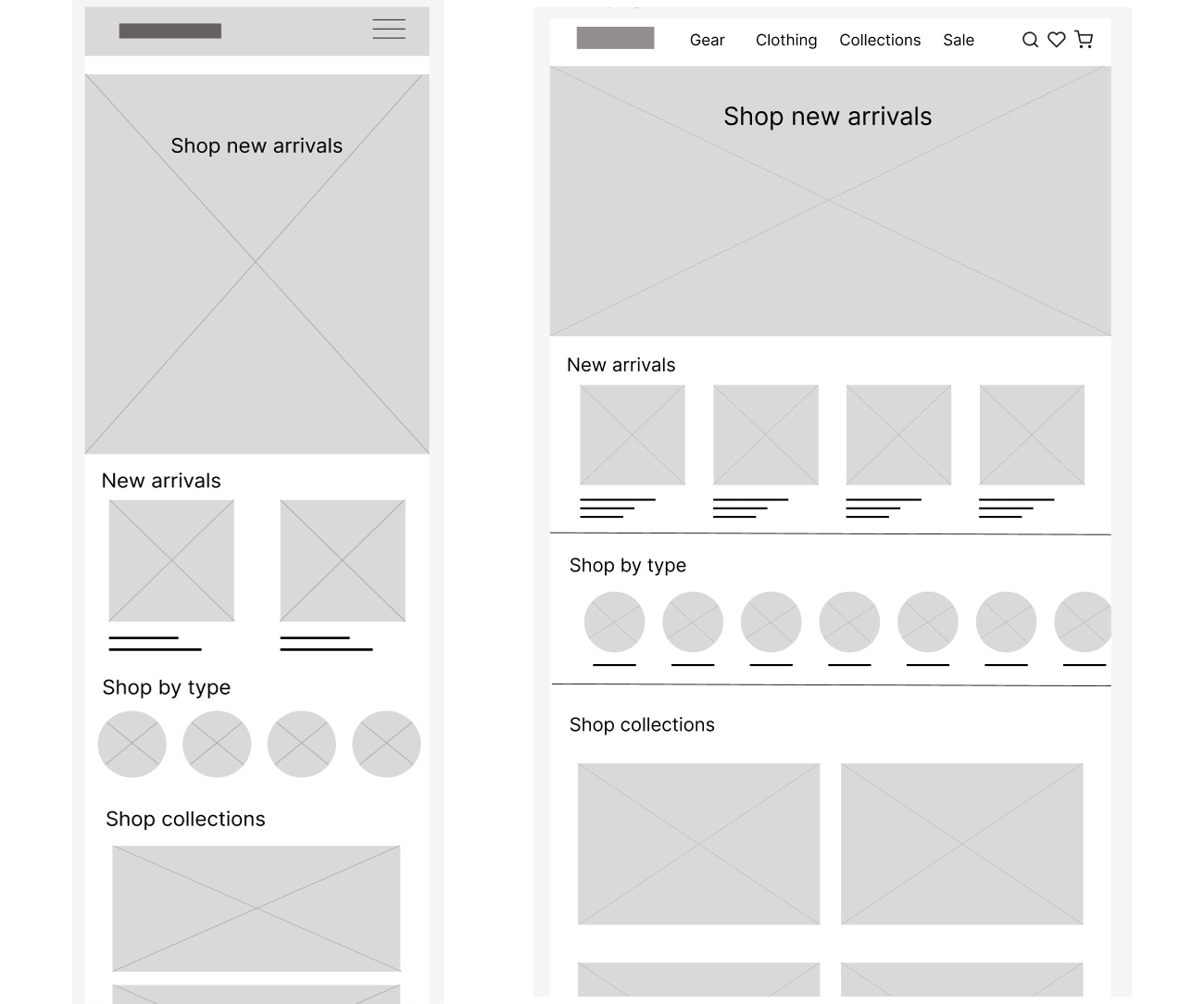
Digital wireframes
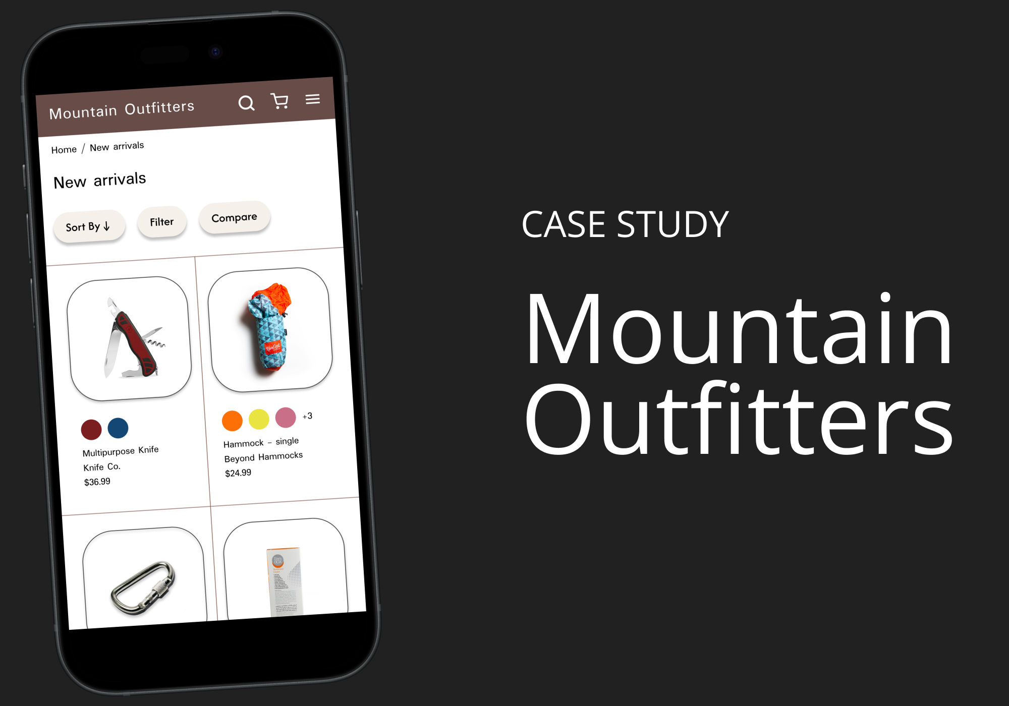
I created digital wireframes in Figma for each of the major pages, including the New arrivals page (see below). I used a mobile-first approach, creating the mobile designs first and then the desktop ones.
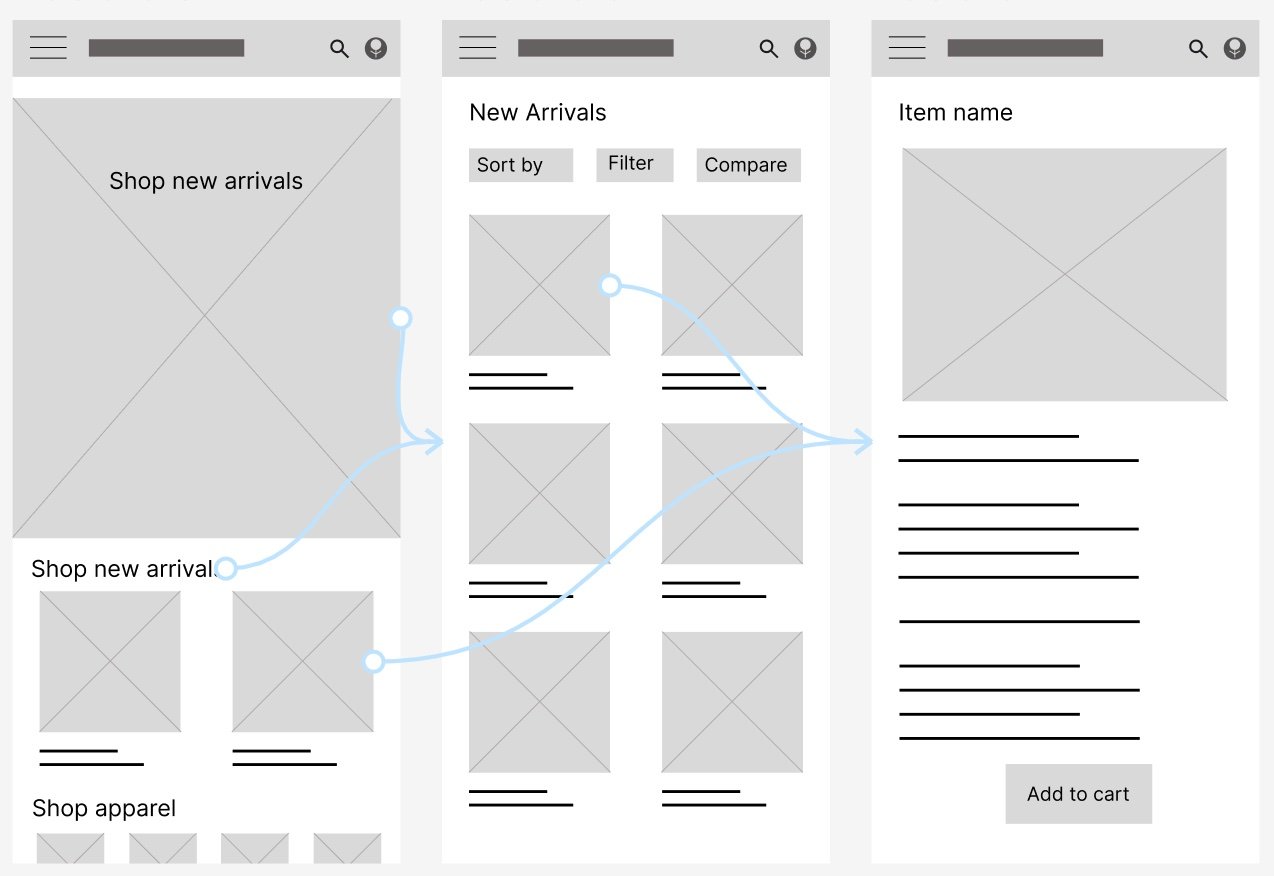
Lo-fi prototype
After establishing the main user flow, I designed a lo-fi prototype in Figma to create connections between pages and prepared the designs for user testing.
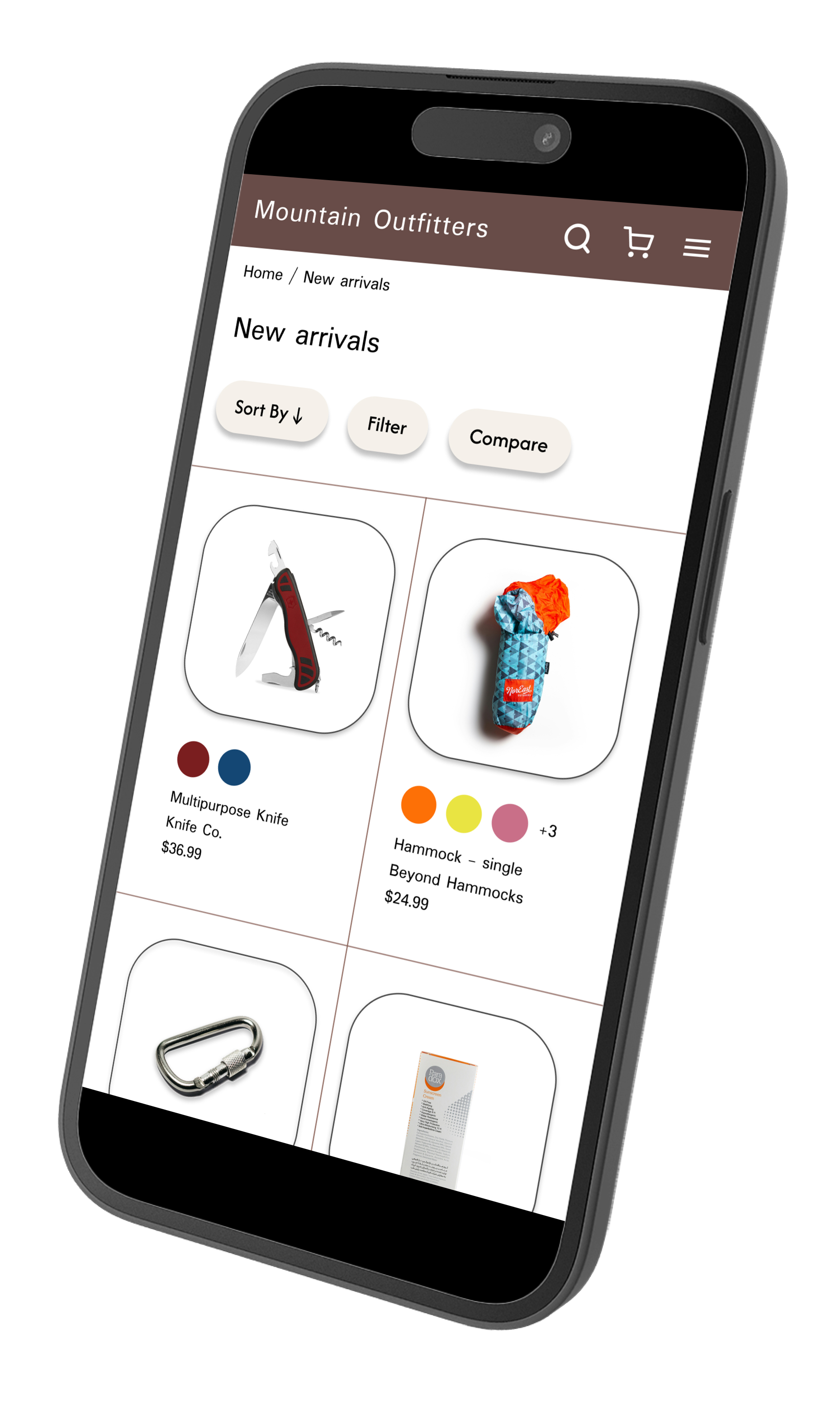
Mockups
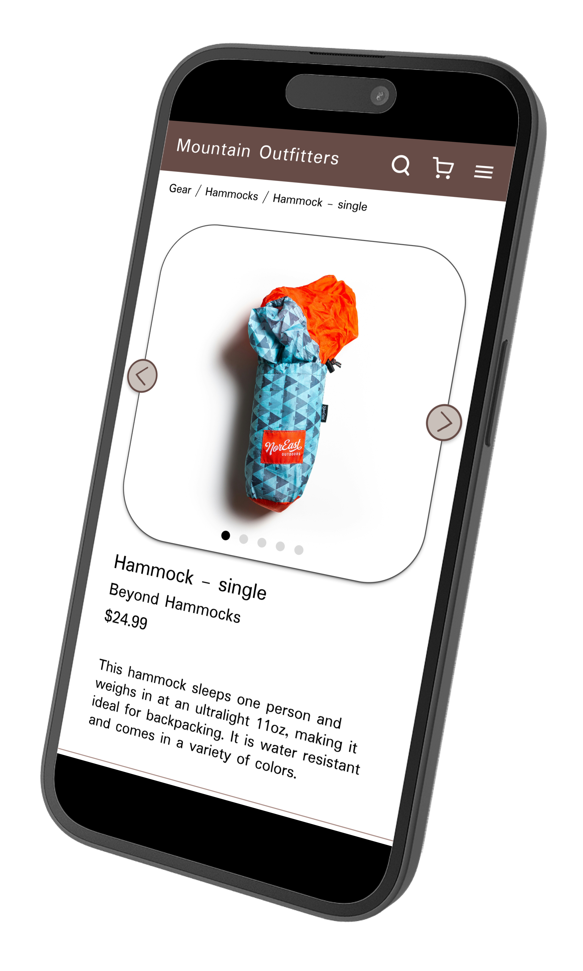
Homepage | New arrivals | Product page: hammock

Accessibility considerations
Colors: I checked that the main colors’ contrast ratios met WCAG guidelines.
Headings: I included hierarchical headings to make content easier to navigate.
Traversal order: I carefully considered the traversal order of each page when designing.
