

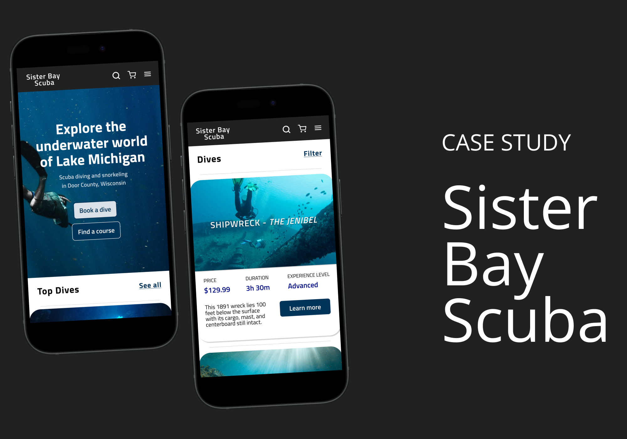
Project overview
The product:
A mobile app and desktop website for Sister Bay Scuba, a fictitious dive shop, designed to help users get scuba certified or book a dive with ease.
The problem:
Many scuba schools have hidden fees, limited information about dive spots, and confusing booking processes.
The goal:
Design an app that makes it intuitive and enjoyable for individuals to find the right course or dive to suit their needs and skills.
Project duration:
September-October 2025
My role:
This was a UX design coursework project. I led the complete design process to demonstrate the full range of skills I learned.
Responsibilities:
User research, personas, problem statements, user journey maps
Information architecture
Paper & digital wireframing
Lo-fi & hi-fi prototyping
Design systems
Usability testing
User research
The goal of this research was to better understand users’ needs, motivations, and pain points. I completed market analysis and qualitative interviews with two potential users, focusing on identifying potential areas for improvement in the current scuba diving booking experience.
Pain points
1. Group bookings
Hard to tell if a group will be able to scuba and snorkel
Difficulty coordinating separate payments in group
2. Hidden costs
Frustration when unexpected costs aren’t included until the end of the booking process
3. Dive details
Unclear website navigation
Lack of detailed information and photos for dive sites
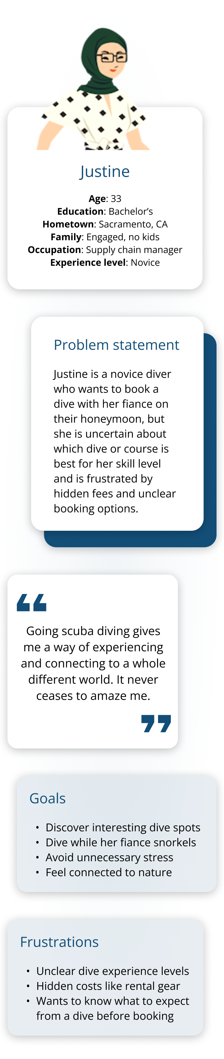
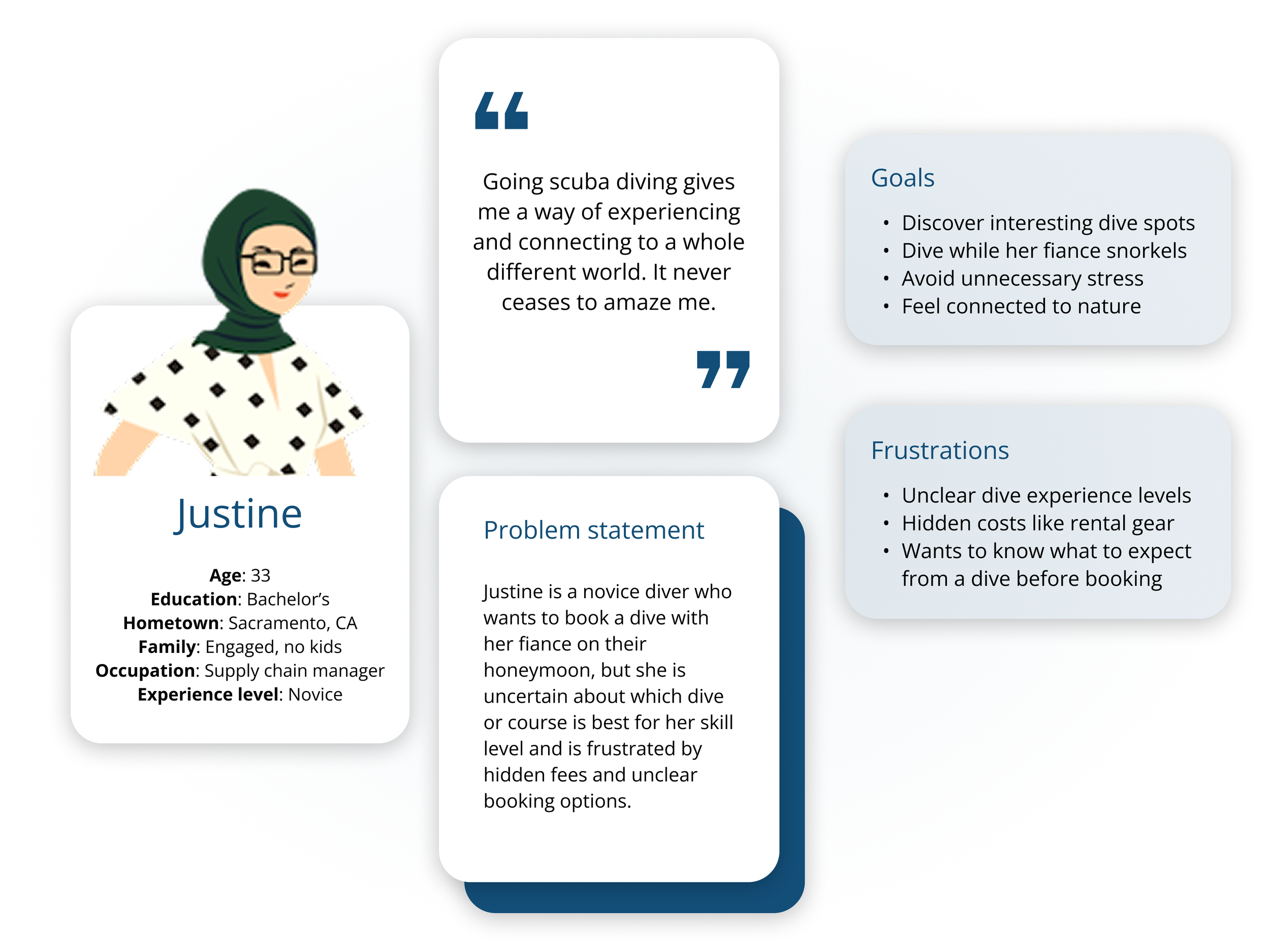
Persona: Justine
User journey map
Goal: Successfully book a scuba dive that meets both Justine and her husband’s experience levels.
| Actions | Choose dive destination | Select dive type or course | Compare and pick dive site | Select a date and time | Finalize and confirm booking |
|---|---|---|---|---|---|
| Task List |
|
|
|
|
|
| Feeling Adjective |
|
|
|
|
|
| Improvement Opportunities |
|
|
|
|
|
Beginning the design process
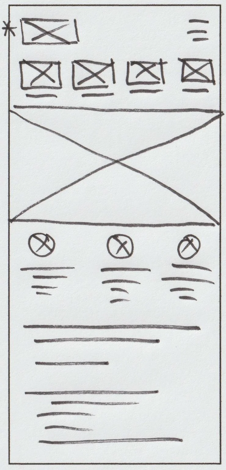
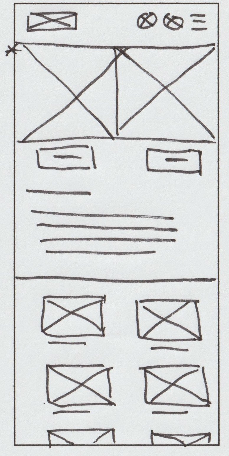
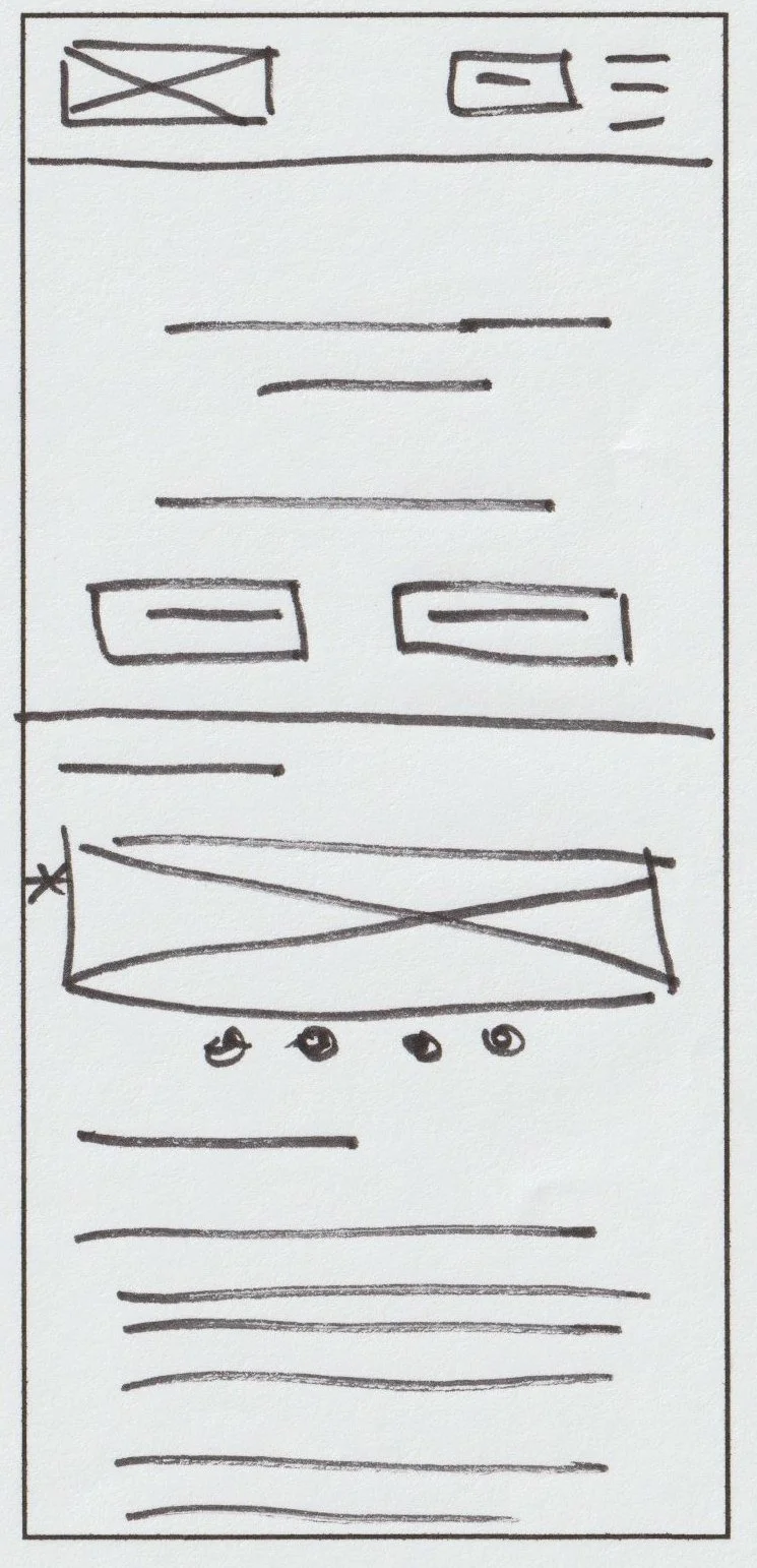
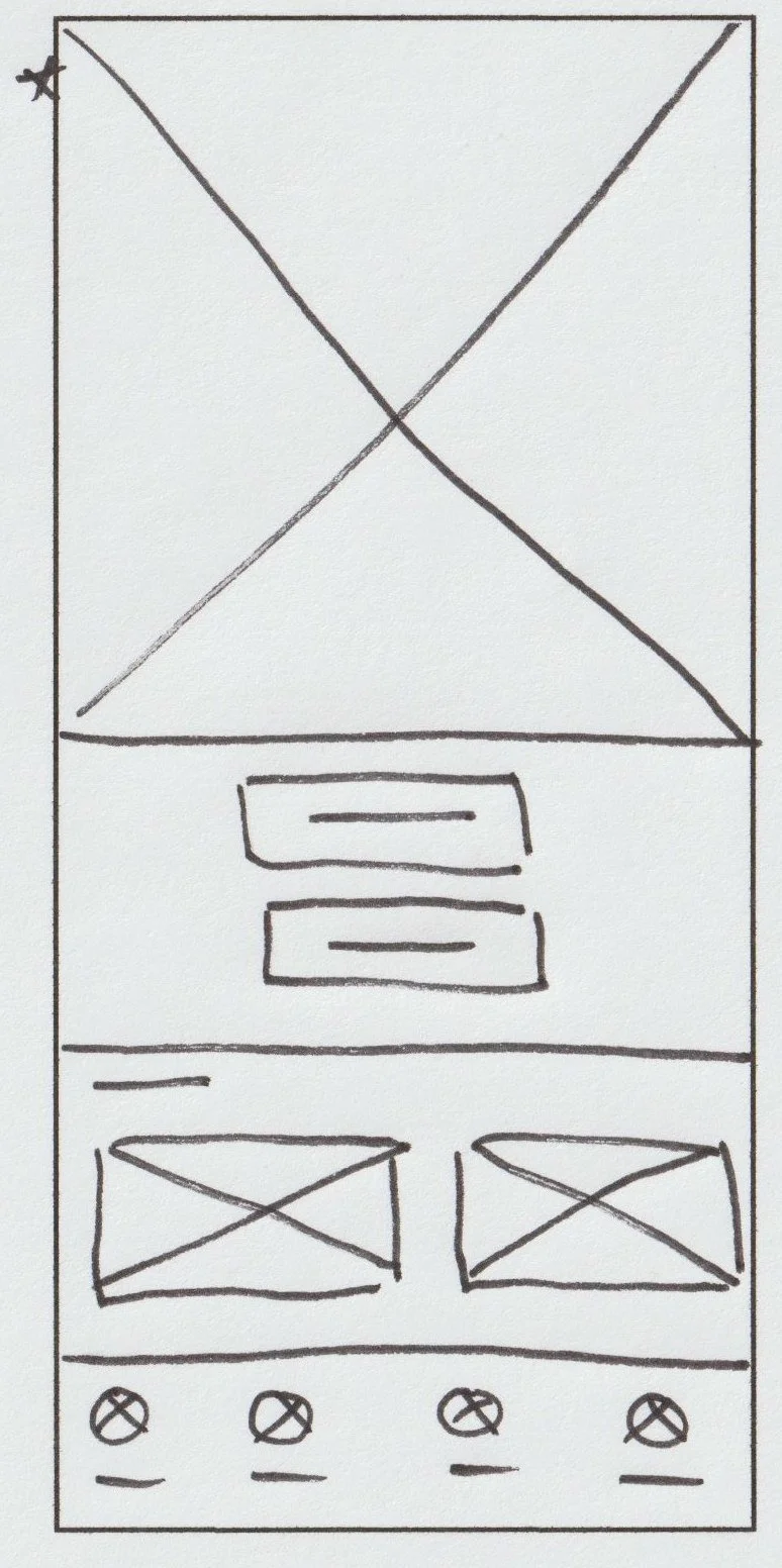
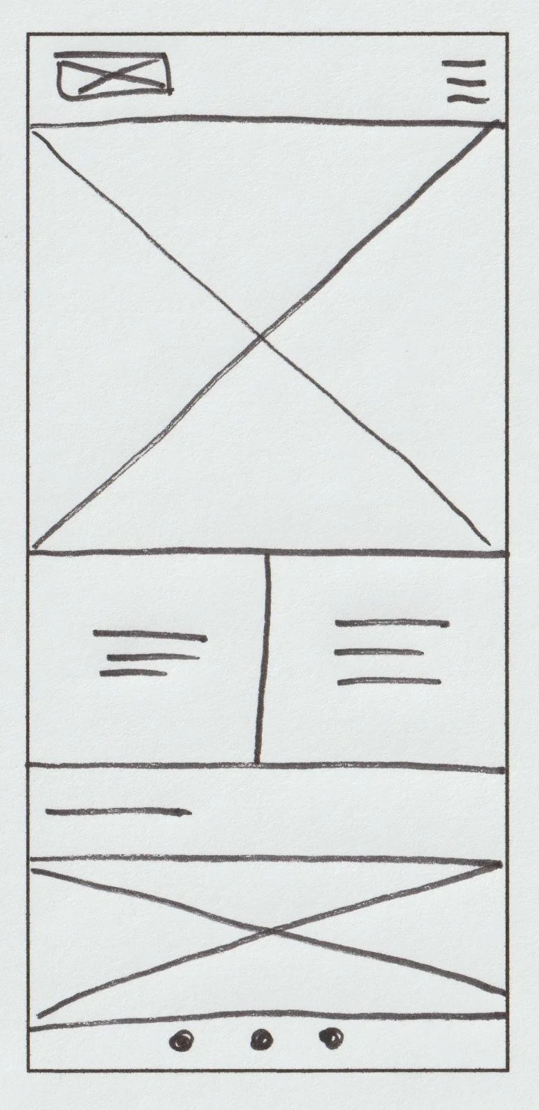
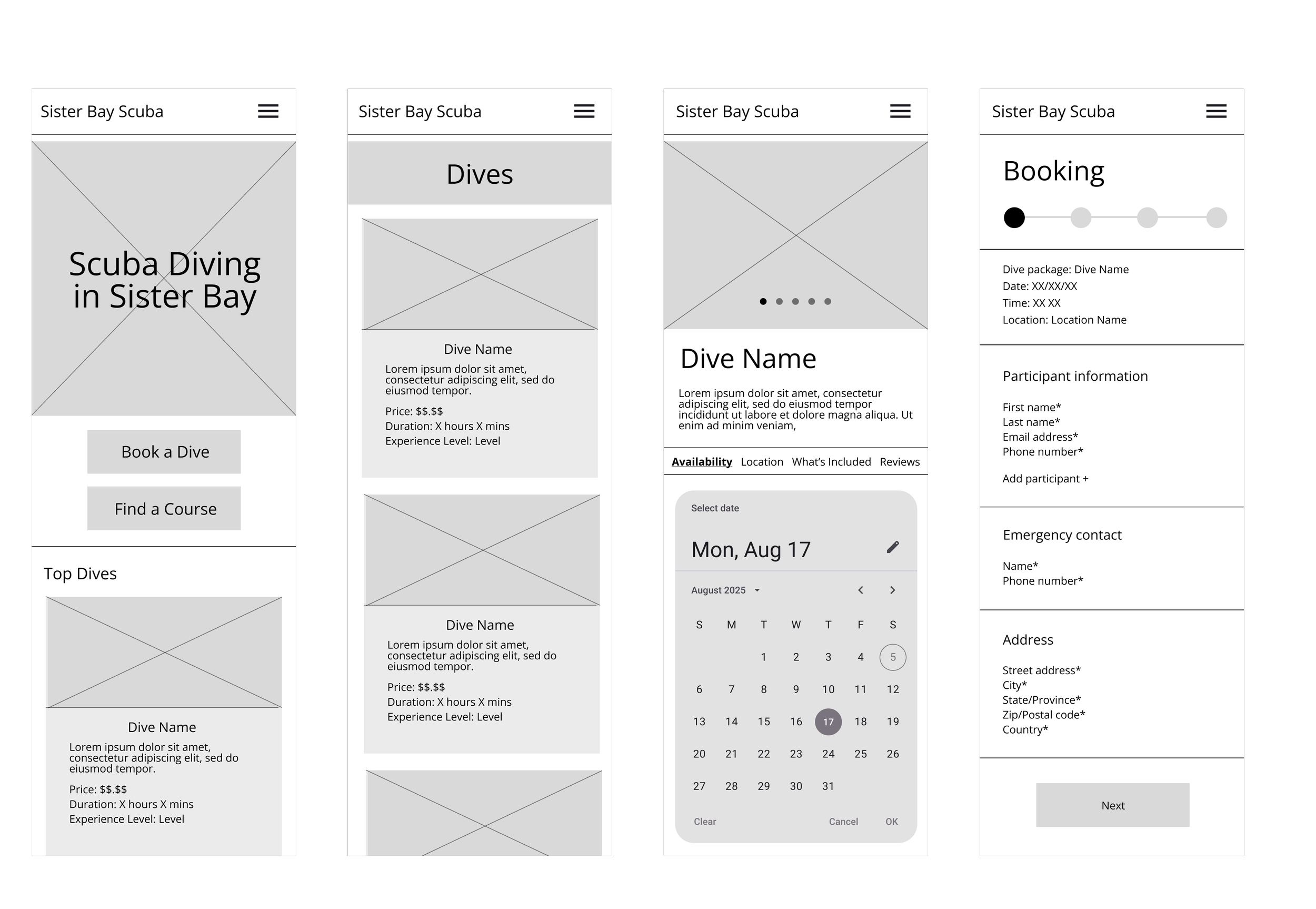
Paper wireframes
I started the design process with sketching by hand to explore a wide variety of possible ideas for the homepage (shown below). Playing around with different elements and placement, I selected the best elements from each wireframe and refined down the design. I then repeated this process for each of the key pages.
Digital wireframes & lo-fi prototype
Using my paper wireframes as a guide, I created digital wireframes in Figma. I then established connections for the main user flow (shown below) to create a lo-fi prototype that was ready for user testing. I streamlined the checkout process to be faster and smoother, while also providing details and visuals.
Usability study
I interviewed two potential users to evaluate the prototype’s functionality and understand how users interact with it.
Parameters:
Study type: Moderated usability study
Location: United States, in person
Participants: 2 participants
Length: 20-30 minutes
Findings:
Add search and cart icons: The preliminary design only had a menu icon so I added search and cart icons to make it easier for users to complete integral tasks.
Include descriptions: Although users found the image carousel helpful, they also wanted more detailed descriptions like dive conditions, depth, visibility, and possible marine life.
Strengthen calls to action: Add a button to make the action users should take more obvious.
Mockups
Incorporating findings from the usability study, I also added imagery, iconography, colors, and typography to create hi-fi designs in different screen sizes.
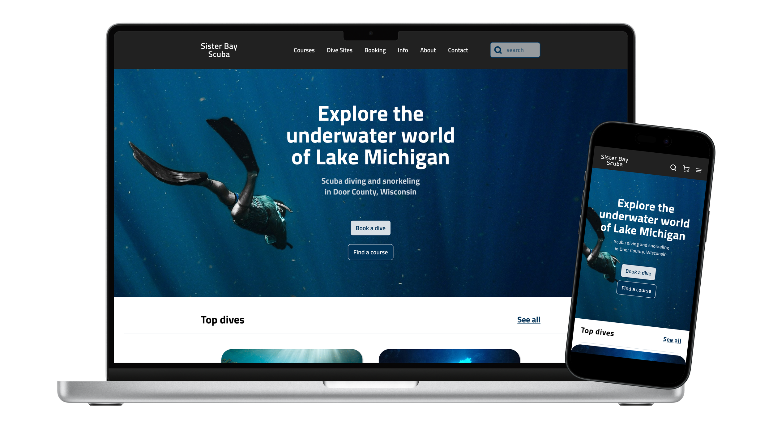
Homepage
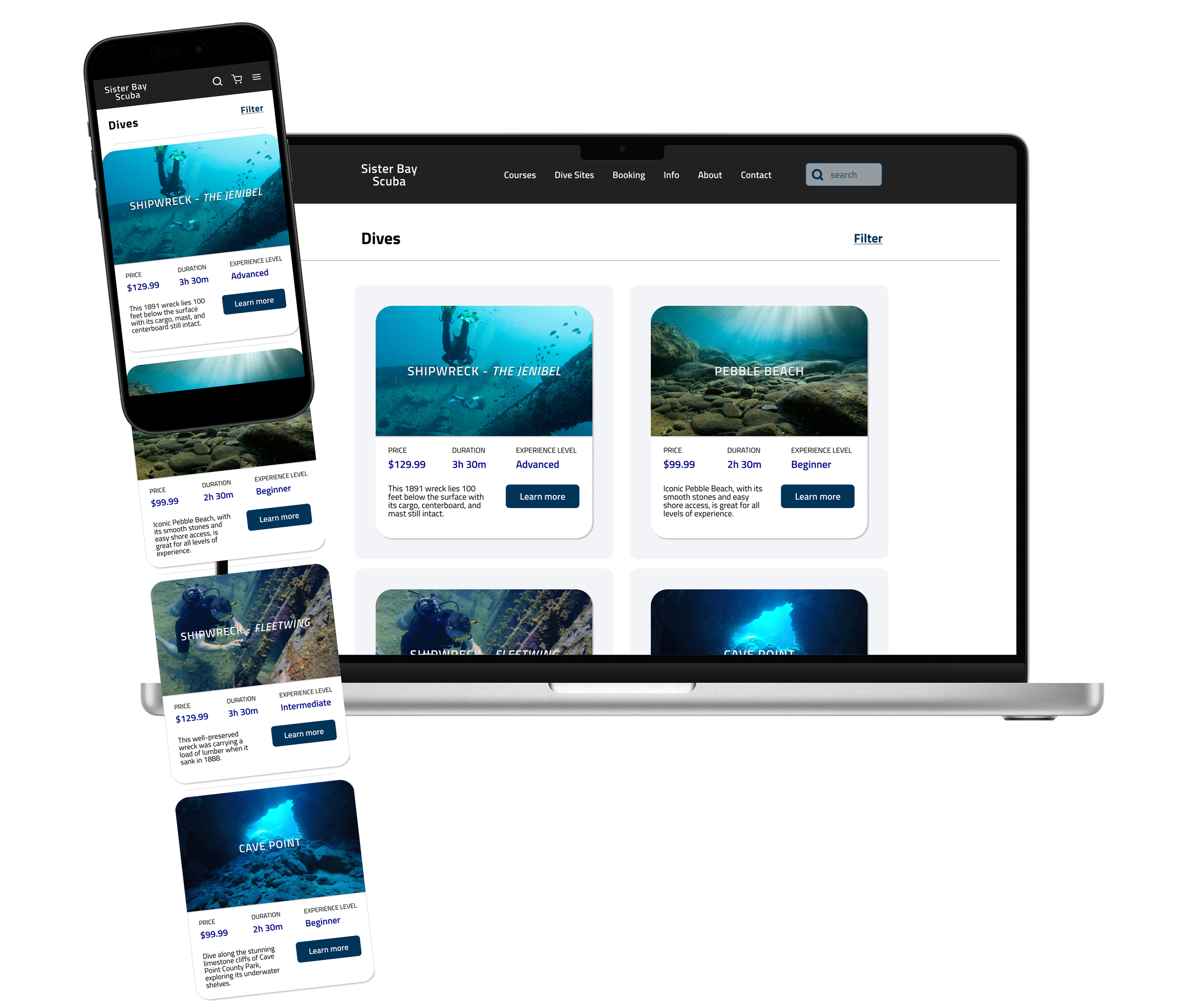
Dives page
Accessibility considerations
Colors: I checked that the contrast ratio for the design’s core colors were within WCAG guidelines.
Headings: I used consistent hierarchical headings to improve readability.
Traversal order: I ensured the traversal order was logical and easy for users to follow.
